I joined Omio (formerly GoEuro) as a product designer in March 2018. At that time GoEuro was still old brand and product experience which was very inconsistent. Later that year we were going through rebranding, so small start-up like team was formed dedicated to this project and I had an opportunity to be part of this team.
Omio
Europe's largest travel booking platform redesigned.
Project goal
The Goal of the project was to completely redesign the web and app experience while applying the new brand, also to keep number risks low we didn't want to introduce any major changes to product core's functionality.
My role & team
Our product redesign team was mainly 3 product designers, 1 project manager and our head of design who was leading the project. I was a product designer responsible for redesigning our core product experience for the web and apps. During this project I was also difining and documenting design system for the new product experience.
Process
Once our brand design team finalized the new brand, colors and guidelines, we kicked off product redesign. We started by auditing our product pages, collecting all page templates and documenting them in a spreadsheet, followed by stages of visual explorations, design, prototype and final handover.
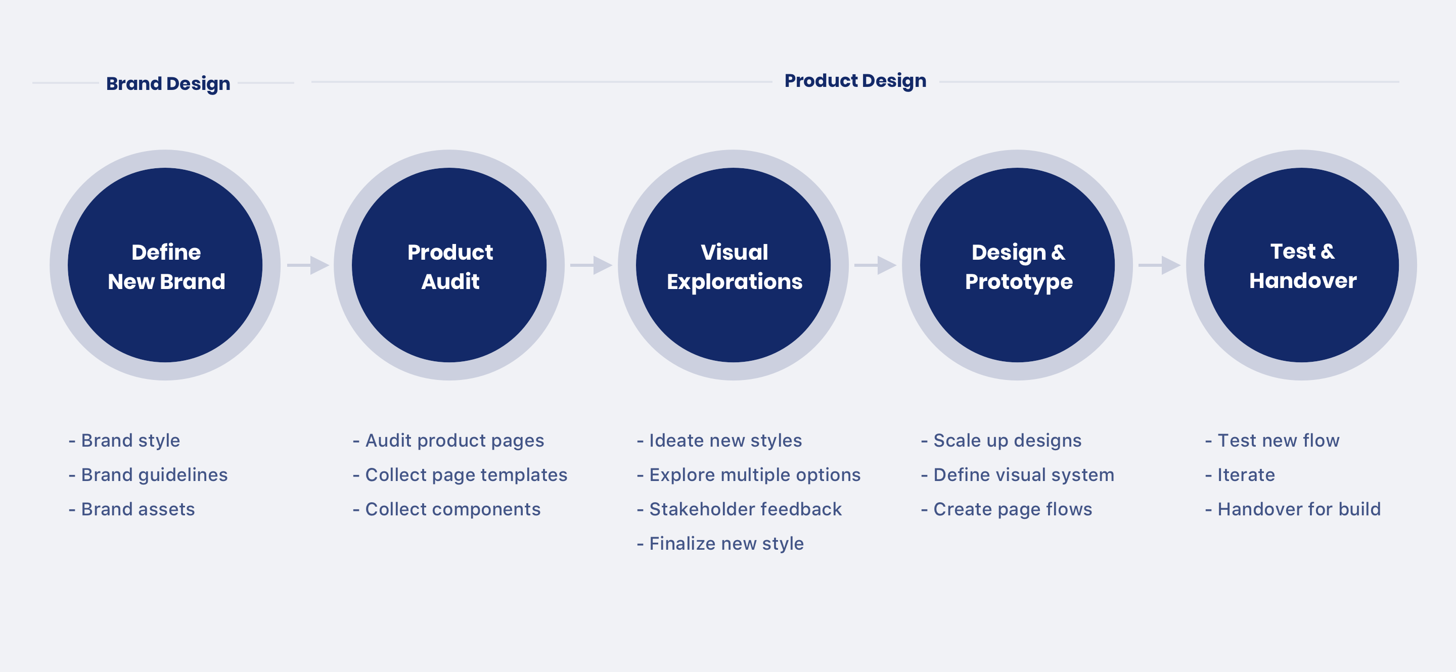 Process outline for the redesign
Product audit
We kicked off the project by auditing our existing product, collecting all page templates and their states to asses the scale. We also did audit of components, style, and icons to address the consistency issues.
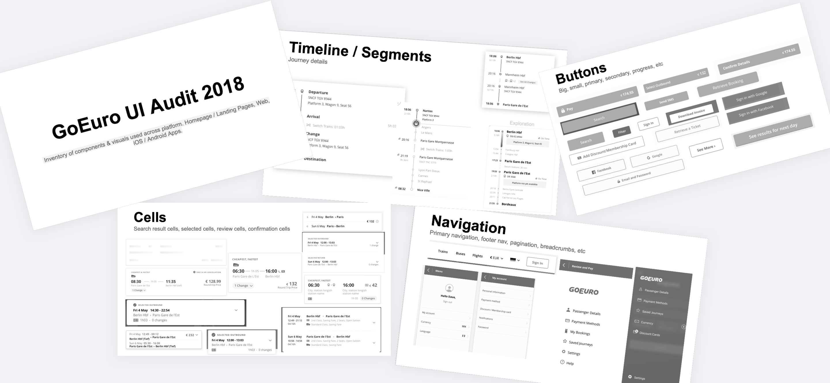 Screenshots of components audit done in 2018
Visual explorations
After documenting audited assets, we started doing visual exploration on new styles. We initially had some mood boards prepared by our brand team to help us with the theme and guide the visual tone.
Designs
Once we nerrowed down on visual styles, we started refining the designs of core screen and started preparing basic screen flows and their states. After few months of team work and lots of meetings, we ended up with new Omio experience.
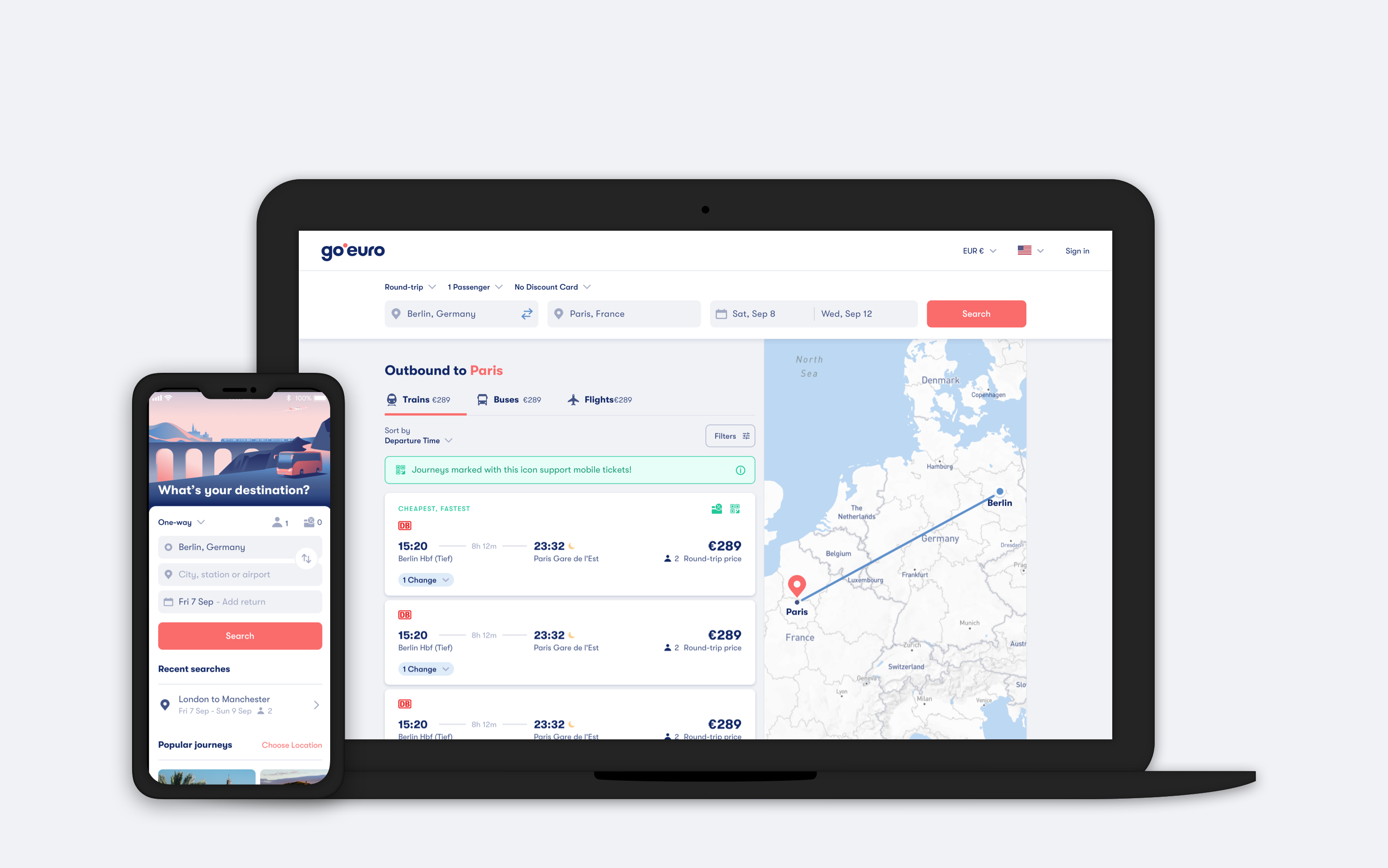 Redesigned Omio app and desktop web
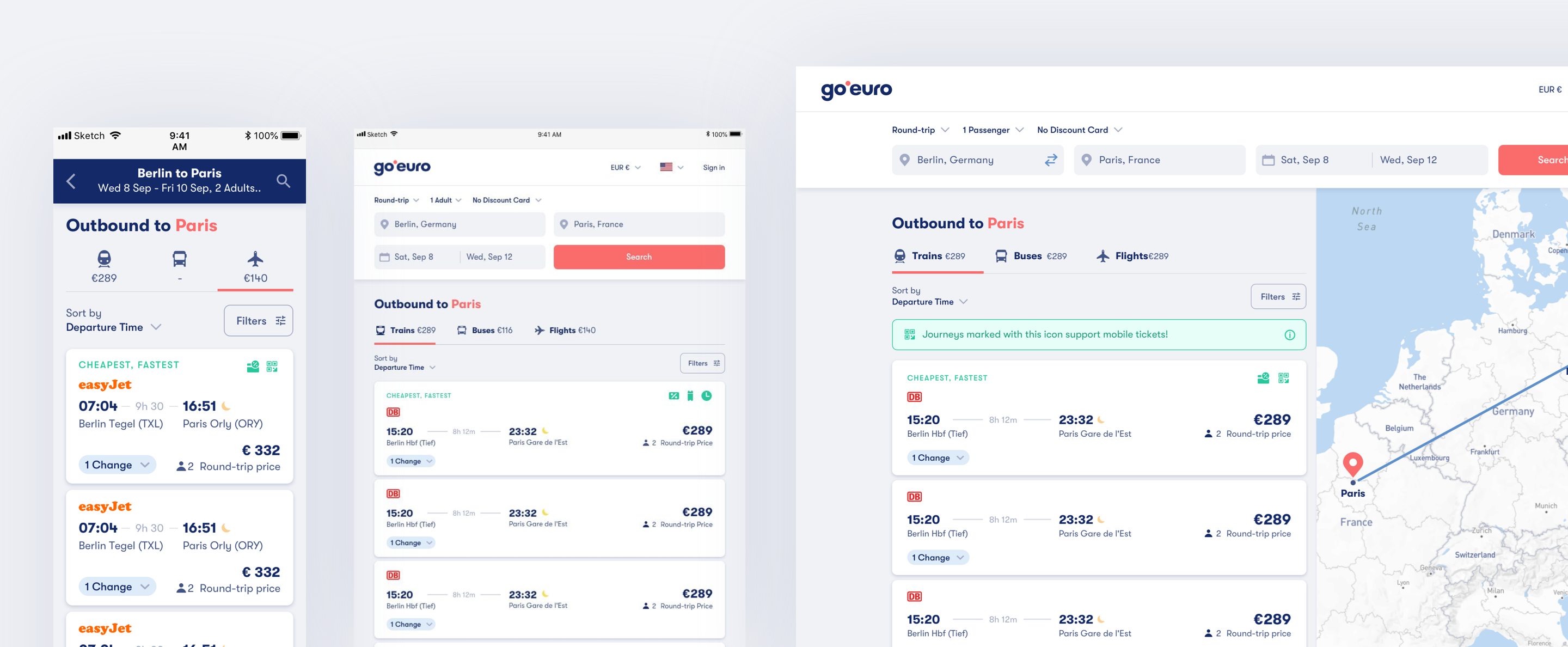 Responsive search results page
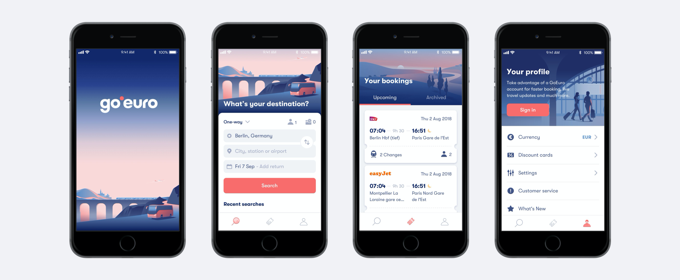 Redesigned Omio iOS app
Omio design system
One more thing that came out of this project other than our new product experience was our own design language system. After finalising new visual styles of our product, I also started documenting all the design decisions that we were taking during the project. As a result we had a collection of re-usable components library and styles guides which later helped our team scale up rest of product pages faster.
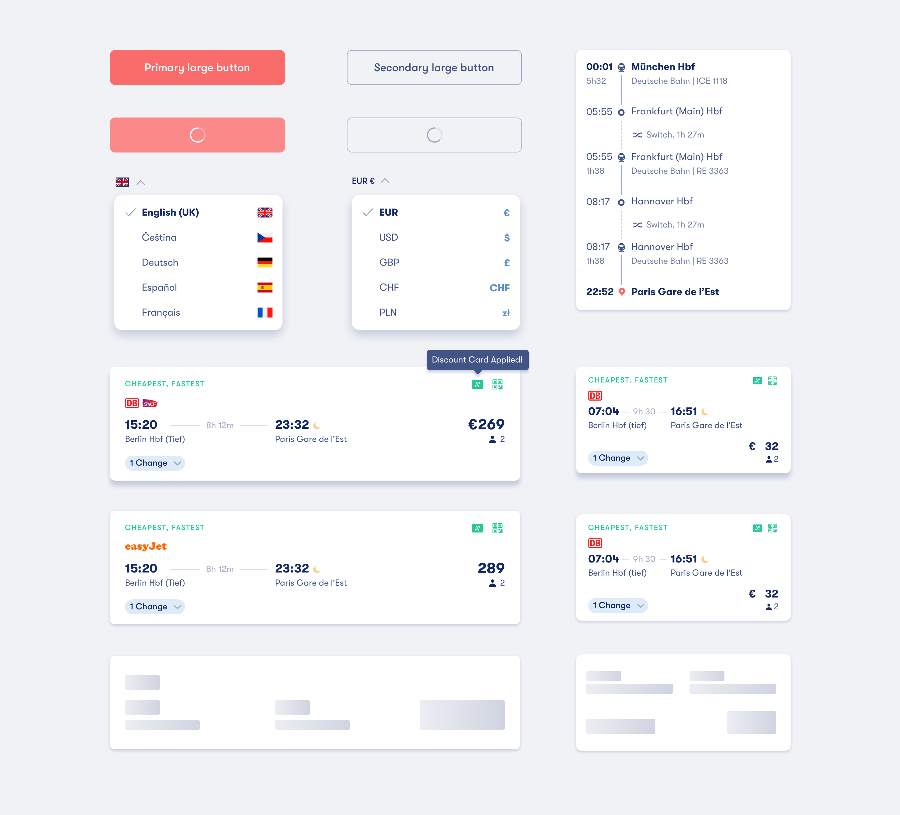 Few components from our design system
Website for the design system
As a spin-off from this project, I now had to maintain and improve our design system which was growing with our product as well. One issue I saw initially after launching our redesign was lower adoption of our design system withing our company and to fix that I decided to launch internal website to document our system.
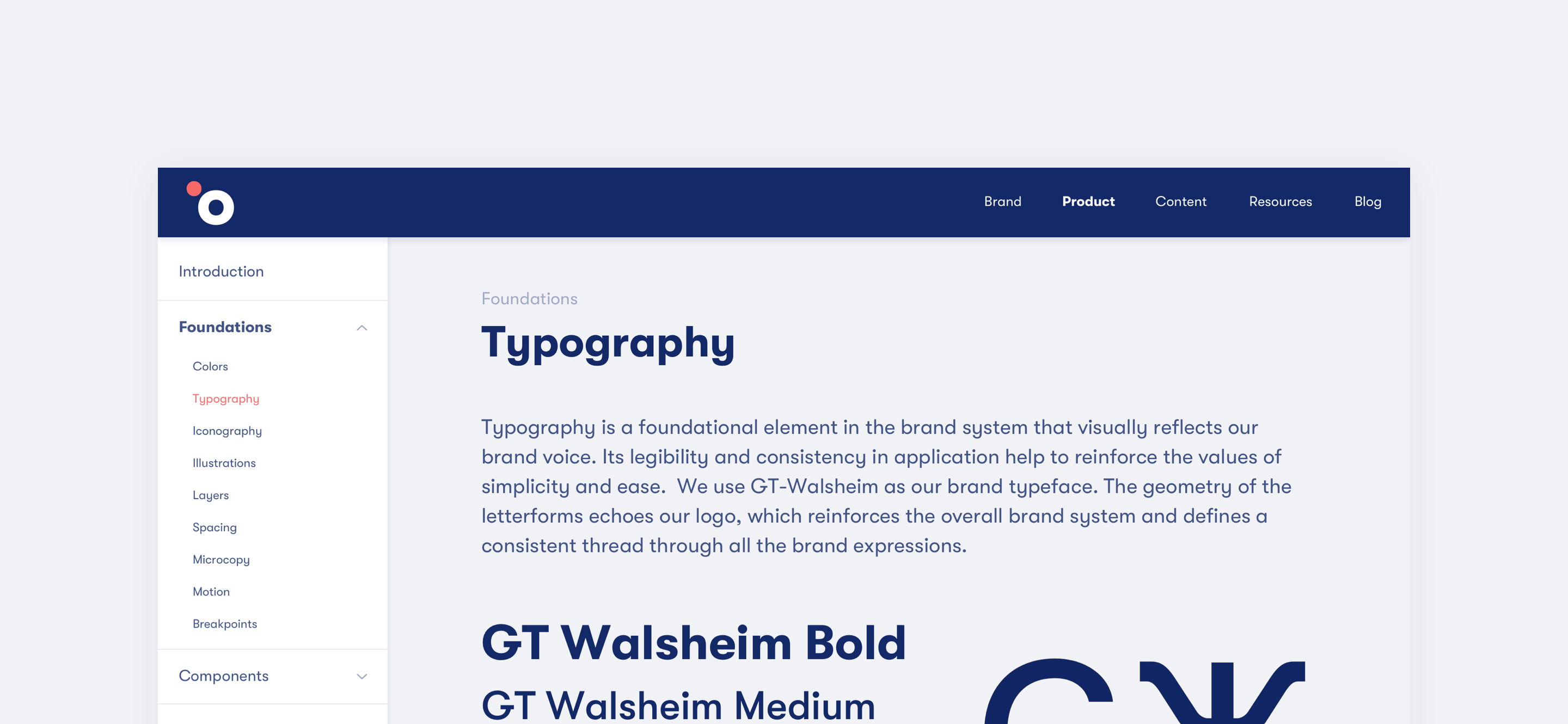 Documentation page for product typography
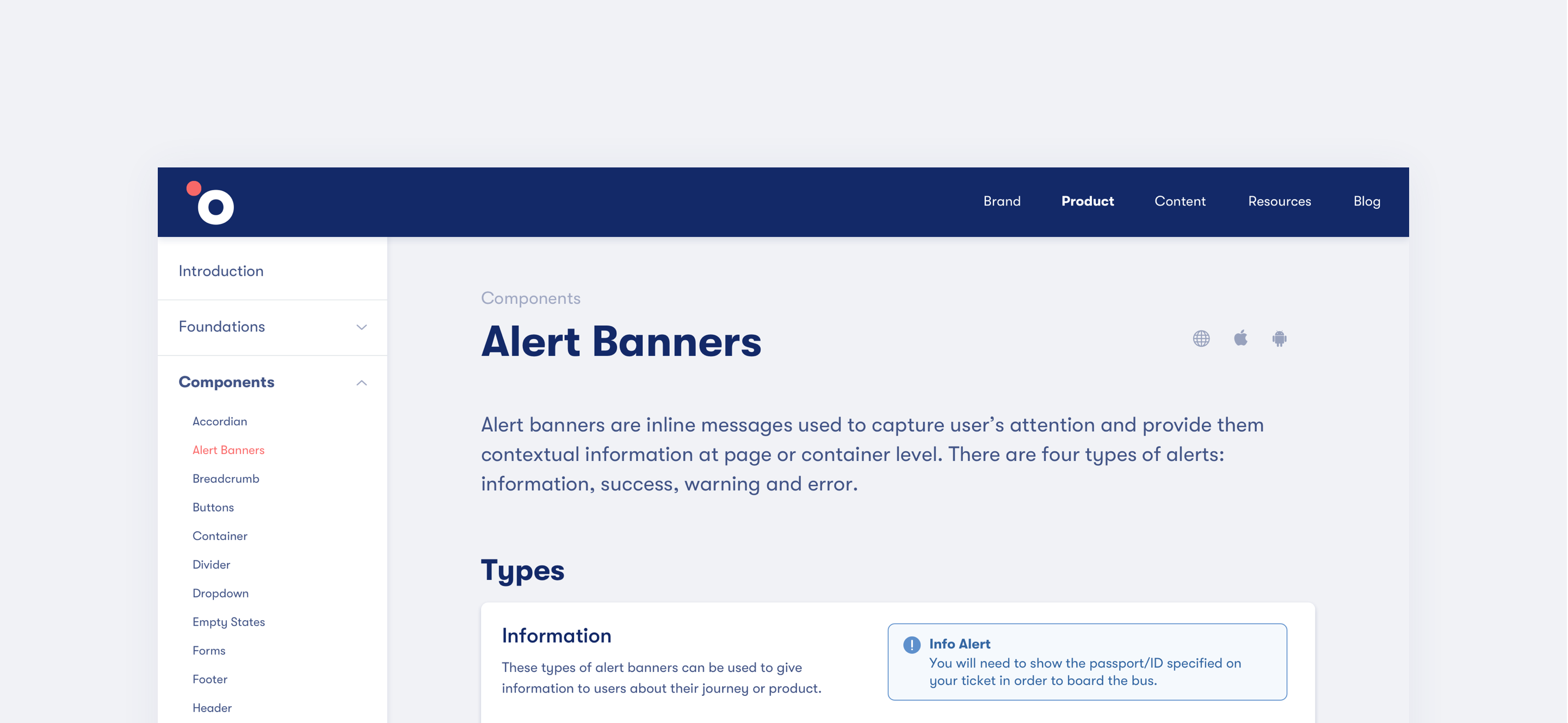 Documentation page for 'Alert Banner' component

